Michala Woodruff
Design Critique #1
Website Design 1
Mr. Chris Harper
3-31-2025
Movie Company Websites
Poor Design
Overall design
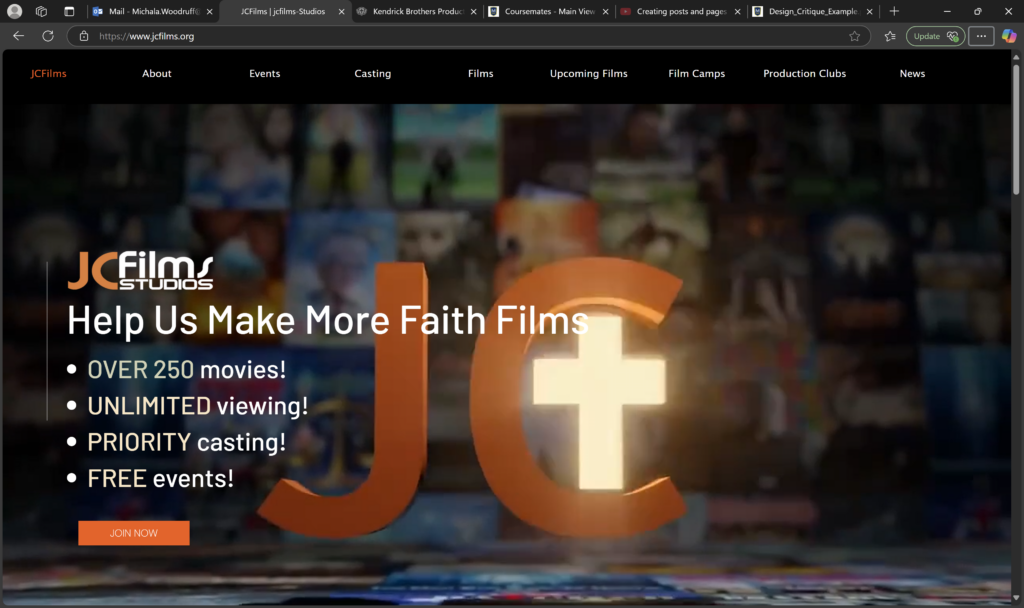
This website offers a 3D feel, at first. It is an animated logo with a moving background of movies. The genre of the website is clear, and while there are many colors, the viewer can still tell the main/accent ones–the dark background and orange letters and button. The overall design is easy to navigate and consistent. However, the fonts, animation, tight space, and lack of a few things categorizes the website as a 4 compared to other movie company websites.
Navigation
The site contains nine navigation pages. In addition, the Film Camps button contains three subs pages. For a website of a movie company, this is not totally out of the norm. Websites in this genre usually contain six to eleven navigation menu buttons, ranging from projects, news, experiences, games, about the company, events, camps, store, contact, and so forth. It may help to have the logo or a “home” button so that the viewer can know how to get back to the main page.
Functionality
Although the viewer can tell which page he or she is on by the theme color orange (which is good for consistency), however, it is not functional for color blind people. Instead, the website should add an orange line appear whenever someone hovers or clicks a button.
Content quality
The animate logo on the front page and some letters below are pixelated. Also, there are sections that are too squished together in that is is diffucult to tell what goes to what. For instance, on the main page is a video without a title. The viewer supposes that it is a trailer for their latest movie. However, a viewer should never need to guess on what something is to a website. In addition, there are a few spelling errors throughout the site, including in the “about” section which is confusing and too vague on their Biblical standing and purpose. Also, some of the text and images extend the website boundaries. Every website should have continent margins.
Site effectiveness
This company’s purpose is confusing or perhaps it is not as deep as I am looking for. They make a lot of movies and seem to have a great system across the United States. It seems to thrive on voluntaries and film camps. It is not totally ineffective. It just needs updating, more quality, deeper material, and better accessibility to everyone such as color blind people. Also, it would be helpful to make the films easier to buy from the website. When the viewer clicks on a film, the ability to rent or buy along with a trailer, reviews, ratings, cast, and the about section.
Excellent Design
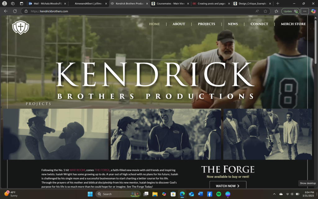
Kendrick Brothers Productions | Films, Books, and Speaking Engagements
Overall design
The main page of this company’s website is very eye catching. The colors flow very well. It is easy to navigate, buy or rent movies, contact, see all their projects, find help, see what they are about, search, buy merch, and so forth. The site is engaging as well with simple buttons, colors appearing on pictures, and video footage of the directing in a banner that takes up around half of the main page’s background. The theme is consistent. I found two themes throughout the website: 1) their core values of Lordship, integrity, teamwork, and excellence, and 2) their light green, navy blue, black and white colors which bring a clean, flowing touch. What this company does is clear and easy to navigate. Its content and website goes deep. Let us dive in!
Navigation
There are six navigation buttons, including a home button, with the logo on the left. The titles of the buttons turn italicized when hovered over or clicked. Also, the buttons below are black and white but turn colorized when hovered over and the title of the film appears. Furthermore, buttons are clear that they are buttons. Navigation is clear and simple.
Functionality
Touching on the italicized buttons, underlined links, appearing titles, and arrowed buttons, these small things are great for telling people where they are and where they can go. Also, it works for color blind people too.
Content quality
For a movie company website especially, several things are vital: 1) quality (pixelated pictures fail to enhance the film itself), 2) colors (one need not use all the colors to be clean and modern; instead, let each color in each place be there with purpose), 3) what is being offered (the main page should make that clear so the viewer need not look for it). This company excels in these areas.
Site effectiveness
The targeted audience here are churches/Christians. Not only do they offer movies, but blogs and books on the content of the films. What makes this site so effect is that its purpose/message is clear, and of course, the design helps.
Leave a Reply