
Michala Woodruff
Mr. Chris Harper
Website Design 1
10 April 2025
Design Critique 2
Poor Quality
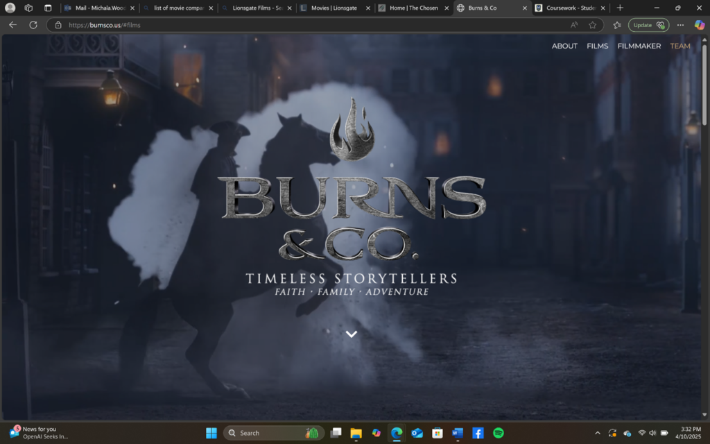
- Overall design
The website has a great eye-catcher that is above the fold. Epic scenes of the movies that the company created flash in the background. However, the site is not clustered or too busy. It is clean and easy navigate, but too simple. Their color is difficult to distinguish; also, due to the fact, that there are no buttons except the ones that lead outside of the actual website and onto another website, the trailer buttons that lead to YouTube (which is embedded in the site), a link, and the scroll down and up buttons. Please note that the home page is the only page.
- Navigation
There are four navigation titles on the top right corner: About, Films, Filmmaker, and Team. When clicked on, the page scrolls down to that section on the home page. The sections are clearly separated from each other; however, less than half of their navigation titles match the section titles. As for the footer, it states that the company contains all rights reserved. This is important, for sure, to keep copyrights and such. However, there is no search, contact form or information, address, social media buttons, logo in the footer, short tagline, donation spot, calling list, or extra navigation. Footers are especially important for people who are searching for something specific, are deeply interested in the company, or for people who’s attention keeps them scrolling to the bottom and they want more without scrolling back up. One more thing, I would mention in the navigation section here is that the website’s tab only contains the name of the company and not the logo. For instance, what if I was researching a bunch of good Christian movies with many tabs open, but because I do not see the logo of Burns & Co., I bypass it as a tab I forgot to close the day before. I would then miss out on some great, quality films!
- Functionality
Referring to what I mentioned earlier, the website is easy to function because it is too simple. When a button in the navigation is clicked or hovered over, it turns light/muted orange. Also, almost all of the text is white on a dark background. I think it would help rest people’s eyes and flow better if the company made its color palette clearer by alternating, boxing, and sectioning off areas with their theme color. Then, there would not be as much white text on black which would rest the viewer’s eyes, although I will mention that the company is concise in their wording so the viewer is not reading much at all.
- Content quality
I love this studio’s movies. They are clean, thick, quality, and contain great Christian messages. I want to know more! However, the website does not tell me enough about the company. When was it established? How was it founded? What is their goal? I know their movies are Christian, so why not say that? Do they have a theme Bible verse that drives the company? I want to know behind-the-scenes insight. There are a few scrolling photos in the “about” section. I want to know testimonials. The problem is that if there are testimonials it is on another linked site that is mixed with other studio projects. Furthermore, the site has a gallery of the team and their roles. That is a great place for buttons and testimonials (which is quite involving and personal).
- Site effectiveness
The website contains a great eye-catcher! That is quite effective. However, the goal and movies are confusing. In the director’s bio, it says that he is a part of more films than those listed. The films that are listed lead to different websites such as Beyond the Mask leads to Christian Cinima while Birthright outlaw leads to Great American Pure Flix. It would be more effective if they kept it consistent and within the website.
Good Quality
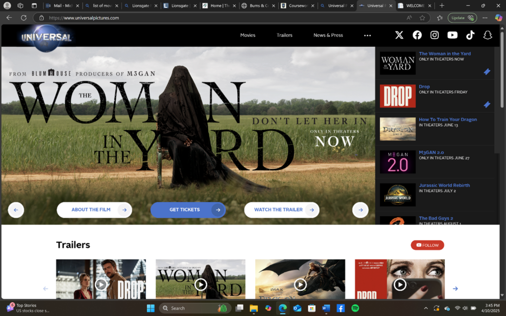
Universal Pictures | New Movies In Theaters & Future Releases
- Overall design
The overall design is fairly descent. The company uses black, white, blue, and yellow as their color palette for sections, text, and buttons. The eye-catcher is a movie poster for the latest project. Upcoming projects are on the right side or can be scrolled. The page is not every long. However, there are quite a few subpages and posts so we can say that the website contains depth. It is mostly user-friendly; however, I think it could use a few more headings over each section. The sections/blocks are clear, maintaining a consistent flow of colors and such. The lines complement each other and keep the home page exciting.
- Navigation
There are only three main navigation pages: Movies, Trailers, News & Press. However, the titles can also open up subpages such as Movies can be customized to “Now Playing”, “Coming Soon”, and “Future Releases”. On the side of these three navigations, there is a “. . .” to open more pages such as “About” and “Universal Parks & Resorts”. Furthermore, at the top right corner in the navigation section, there are six social media buttons. Universal thrives on social media and sharing. Under movie posters and trailers, the viewer can share the content simple and fast. The site is user-friendly as well as accessible for color blind people. There are bars in their theme color blue that appear when hovered over. When clicking on a page, the viewer can tell what page he or she is on by the title next to the logo on the left and by the line above the navigation title. Also, the website contains scrolling bars that show how far into the list the viewer is. Although there is a lot of content and things to explore, it is easy to know where you are inside the website. It is not overwhelming. In addition, I should mention that Universal contains a footer with extra information such as careers, social media buttons, policies, their logo and the three navigation pages listed in the header, contact us, sitemap, about, a link to a movie rating guide for parents, and more.
- Functionality
The website is fast paced, which is especially important when hosting many trailers, images, and videos. Although this website contains more words, the background is white while the text is black, making it easy to read. Clicking on posts lead the audience to articles to other news websites. However, it is easy to share those posts as well on your own social media platform. The posts are clean, well-organized, and the “read more” button gives a nice flow due to the themed blue. The press releases are not the only ones that lead the viewer outside the Universal Studio website, but the “Universal Studio Parks & Resorts” leads to another website of the same company (which, of course, has a different goal). Nevertheless, it is really clean and easy and consistent.
- Content quality
Something that stuck out to me in this company’s quality was their timeline of all the different animations of their logo. It was different, eye-catching, engaging, and effective. The content is easily accessible while they also try to sell tickets, get you to stream, sign up for a newsletter, and share their content. They provide behind-the-scenes without signing up for anything too. Their trailers are a big hit for them, and they put it out there well (although I do not agree with all the movies). I still would like to know their goal in all their movies, however.
- Site effectiveness
The call to action is clear—visit the theater, sign up to be in-the-know, follow them on social media, stream their stuff, share their content with others. That is a big reason I think it is a successful website. They provide things to their viewers, and what they ask is easy and seems beneficial to you.
Leave a Reply